William Haines Hall Art Illustrator - Designer of Stanford Football Programs
8th Mar 2022
William Haines Hall was an illustrator who lived in the Bay Area. Hall moved to San Francisco from Missouri in 1925 and enrolled at the California School of Fine Arts. He then worked as a fashion illustrator for a local newspaper before establishing a commercial art studio and working for the advertising firm of Patterson & Sullivan, later named Patterson & Hall, where he was a partner. He was a member of the Bohemian Club in San Francisco, a club for artists, writers, and journalists. He was also a member of the Thirteen Watercolorists, an art group based in Oakland. Among the clients of his advertising firm were Stanford University. He was at the vanguard of what would become known as the "California Style," of art and his work blended the traditional distinction between commercial art and fine art.
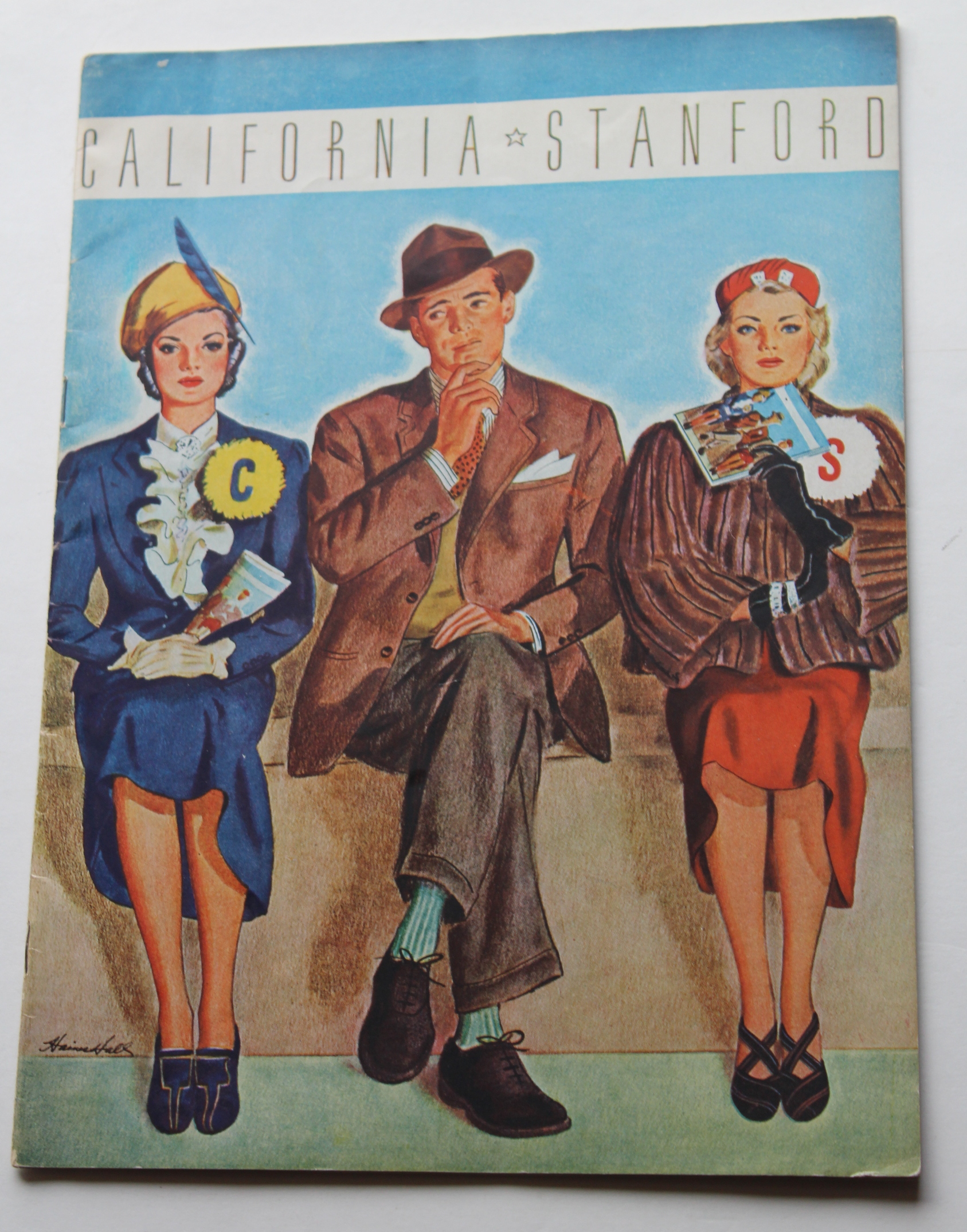
Hall's first work for Stanford was the Stanford-California program cover of 1937. It set the tone for all his future covers, which was to show men and women who were fans of Stanford and California at odds. In this one, the man in the middle is sitting between a Stanford fan and a Cal Berkeley fan, trying to decide which one to ask out, presumably. Notice the cover of the program the Stanford fan is holding which contains an image of the program she is depicted in in 1937.
Hall's masterpiece was the 1938 Stanford-Dartmouth football game cover, seen above. It shows a Dartmouth fan arriving in Palo Alto wearing a heavy winter coat and a Dartmouth tie with large suitcases. He is meeting his dainty girlfriend who is wearing a summery white dress, white gloves, and a big Stanford button. The contrast is not only among two different fans, but also between the cold east coaster and the bright, beautiful west coast girl. It is one of the best college football covers of all time. Notice in the background of the image is the train the student disembarked from.
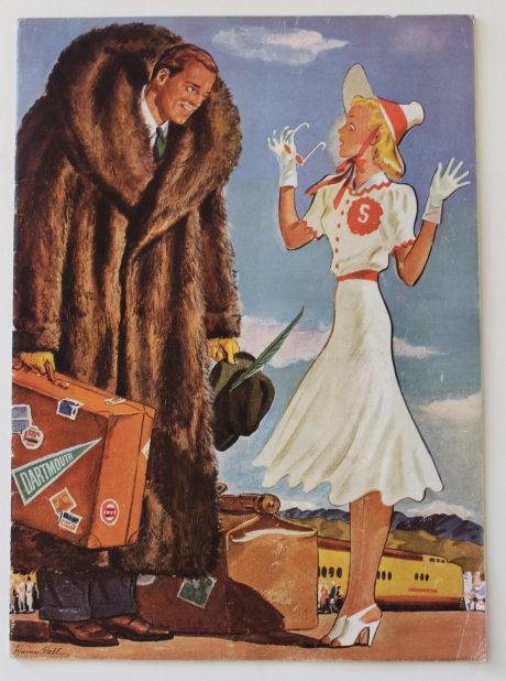
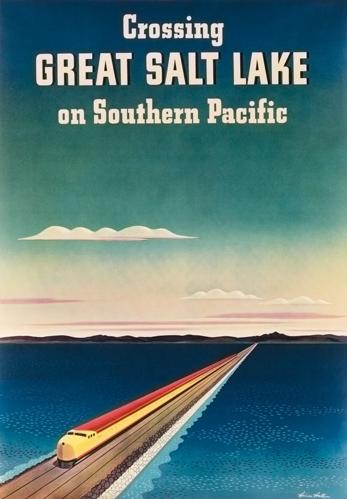
Hall also drew posters for the Southern Pacific Railroad, including this beauty, below, titled "Crossing Great Salt Lake." The sleek trains portrayed in the 1938 Stanford program and the poster for the Southern Pacific are almost identical.
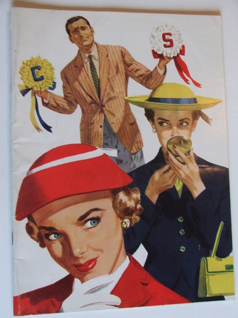
In addition to the 1938 Dartmouth-Stanford program, Hall also did the cover illustrations for the Stanford-Cal rivalry in the 1950s. The games alternated between Stanford and Berkeley and Hall did the covers in 1953, 1955, 1957, and 1959. The 1953 program continues the theme of a well dressed man trying to pick from one of two girls, one a fan of Stanford and another a fan of the Golden Bears. The imagery and innocence of the women is classic 1950s.
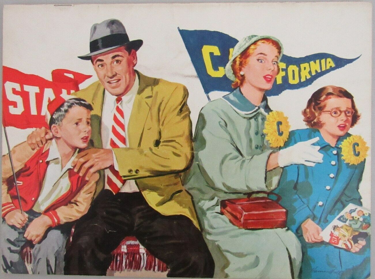
The theme of split loyalties among the people pictured on the 1955 cover continues his theme. This time, the father and son are Stanford Indian fans (the current team name of Cardinal was adopted later), while the mother and daughter are rooting for California. Notice the daughter is holding a "picture in picture," copy of the program she is actually in, a clever technique Hall used again.
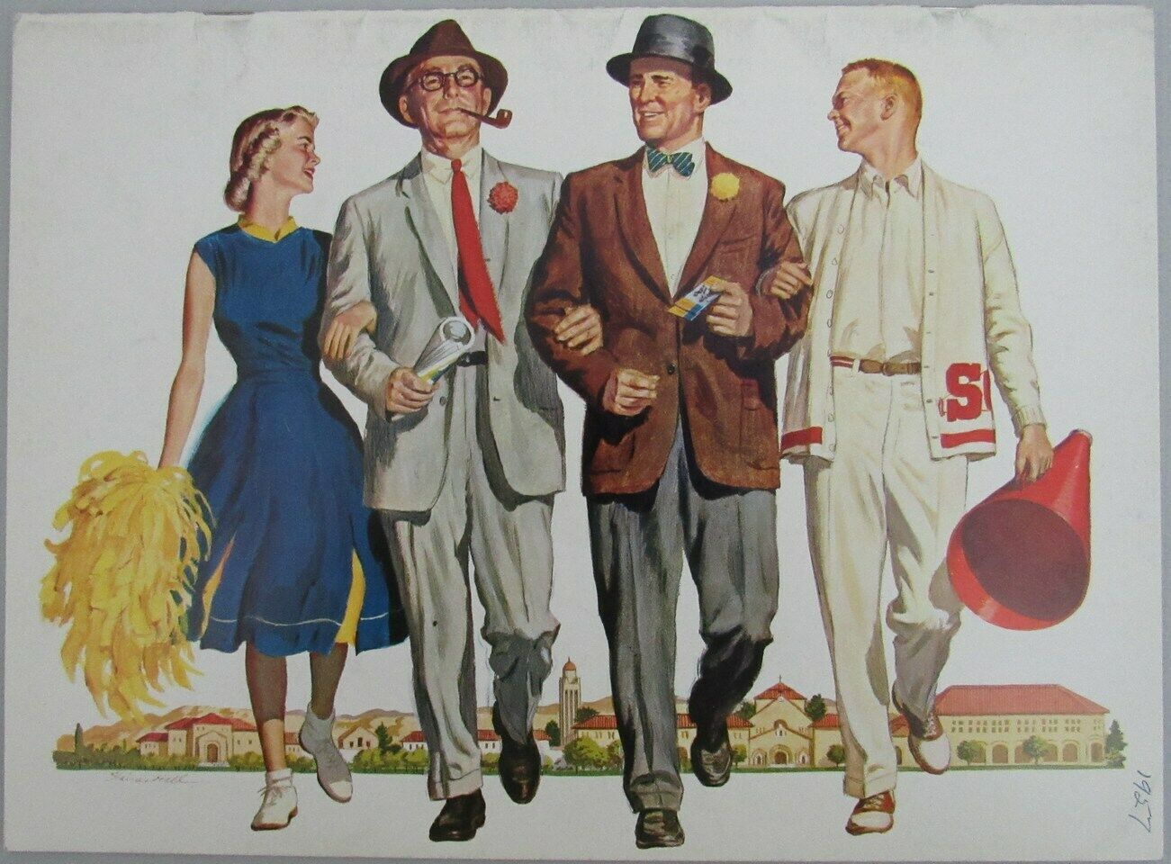
The 1957 program, below, features two students, one whose father is a Stanford fan carrying a megaphone and wearing a white Stanford sweater, and a female student carry a pom-pom and wearing bobby socks, whose father is a University of California fan. The Stanford campus is pictured beautifully in the background. It is again such a classic 1950s image. Haines Hall had an eye for capturing the spirit of the event and the times and does an especially good job capturing the wholesomeness and prosperity of Eisenhower Era post-war America.
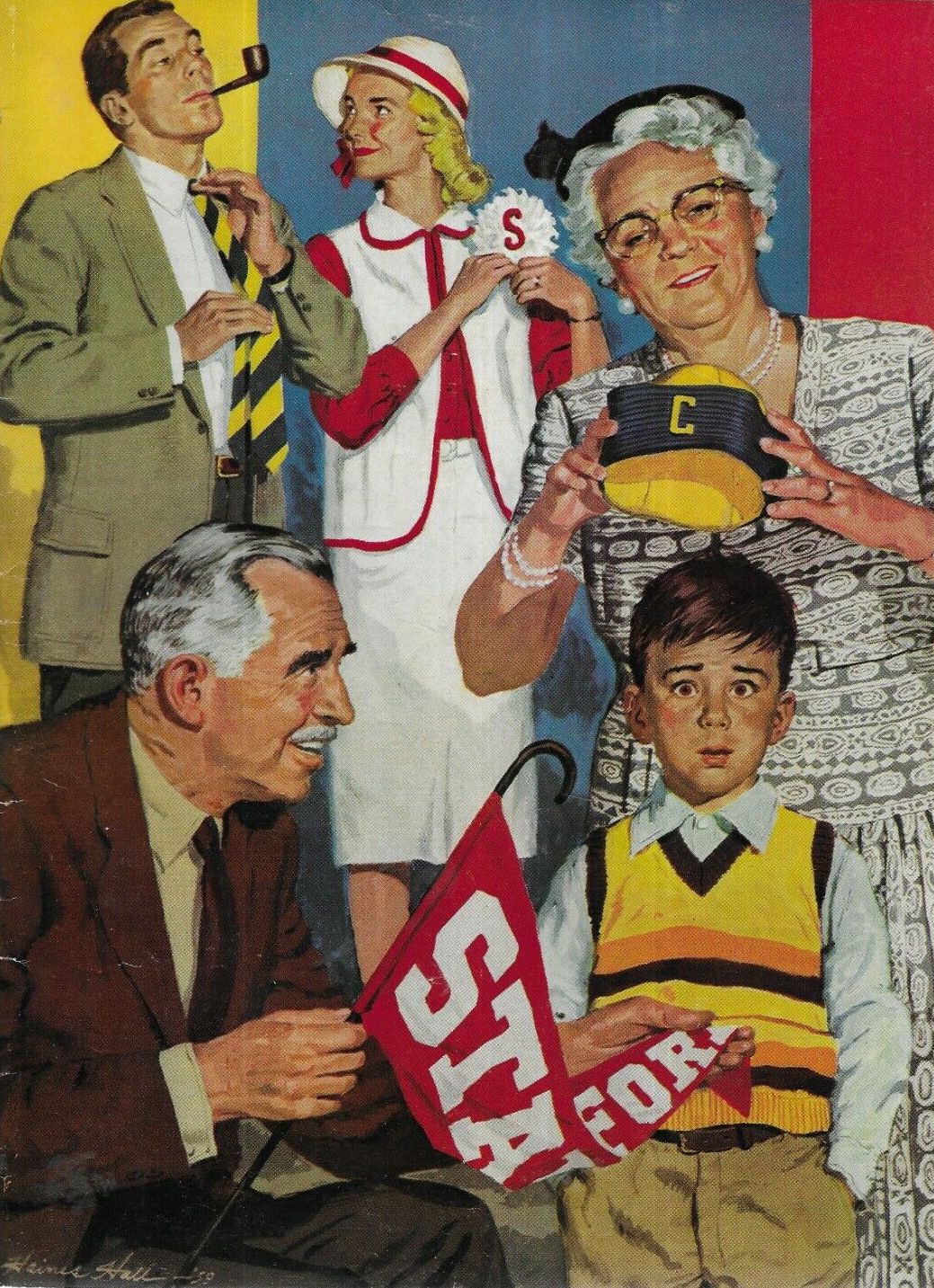
The 1959 program, below, his last design for Stanford, features three generations, but follows the same theme as his other five cover illustrations. The grandfather and his daughter are Stanford fans and the father and grandmother are California fans, leaving the poor little tot bewildered as to where his allegiance lies.
Prior to his works doing cover illustrations, Hall designed covers for a monthly publication: Standard Oil Bulletin (Standard Oil of California is today's Chevron). The company was based in San Francisco and hired local illustrators to do their covers. His use of color and the portrayal of average people is spectacular. The artwork is museum quality, yet adorns the cover of an oil company's magazine. The Bulletin was published beginning in 1913 and through the 1950s and Hall did fifteen covers in total between 1934 and 1942.
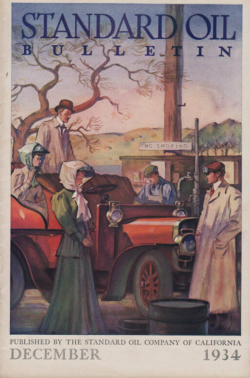
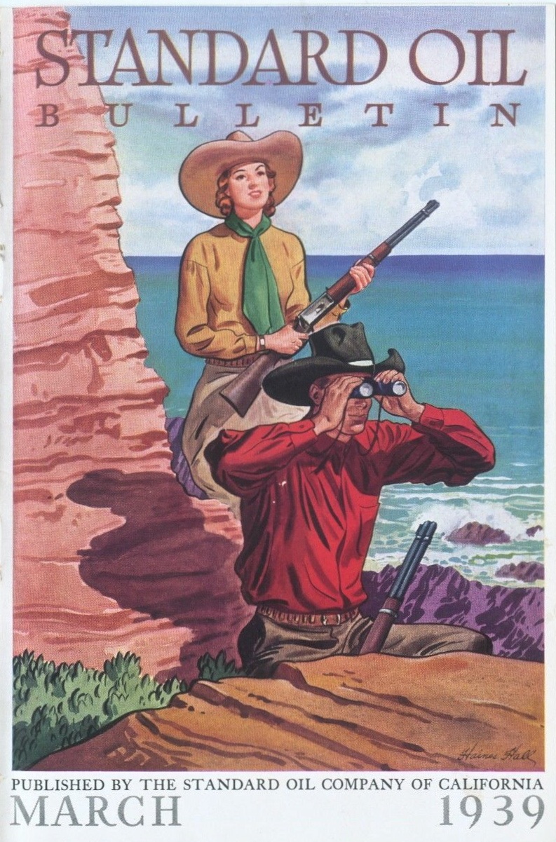
As the company stated in each issue, "The aim of the Standard Oil Bulletin is to furnish first hand and authoritatively to the Company stockholders, employees, and patrons, as well as the general public, facts concerning the Company's business and its methods." Hall captures the spirit of the west particularly well in the image below.
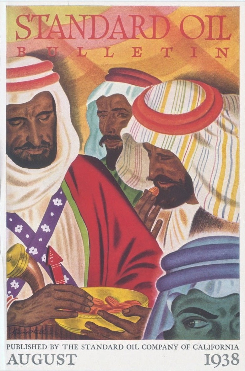
This image from the 1938 issue has a middle eastern theme, showing Hall's versatility.
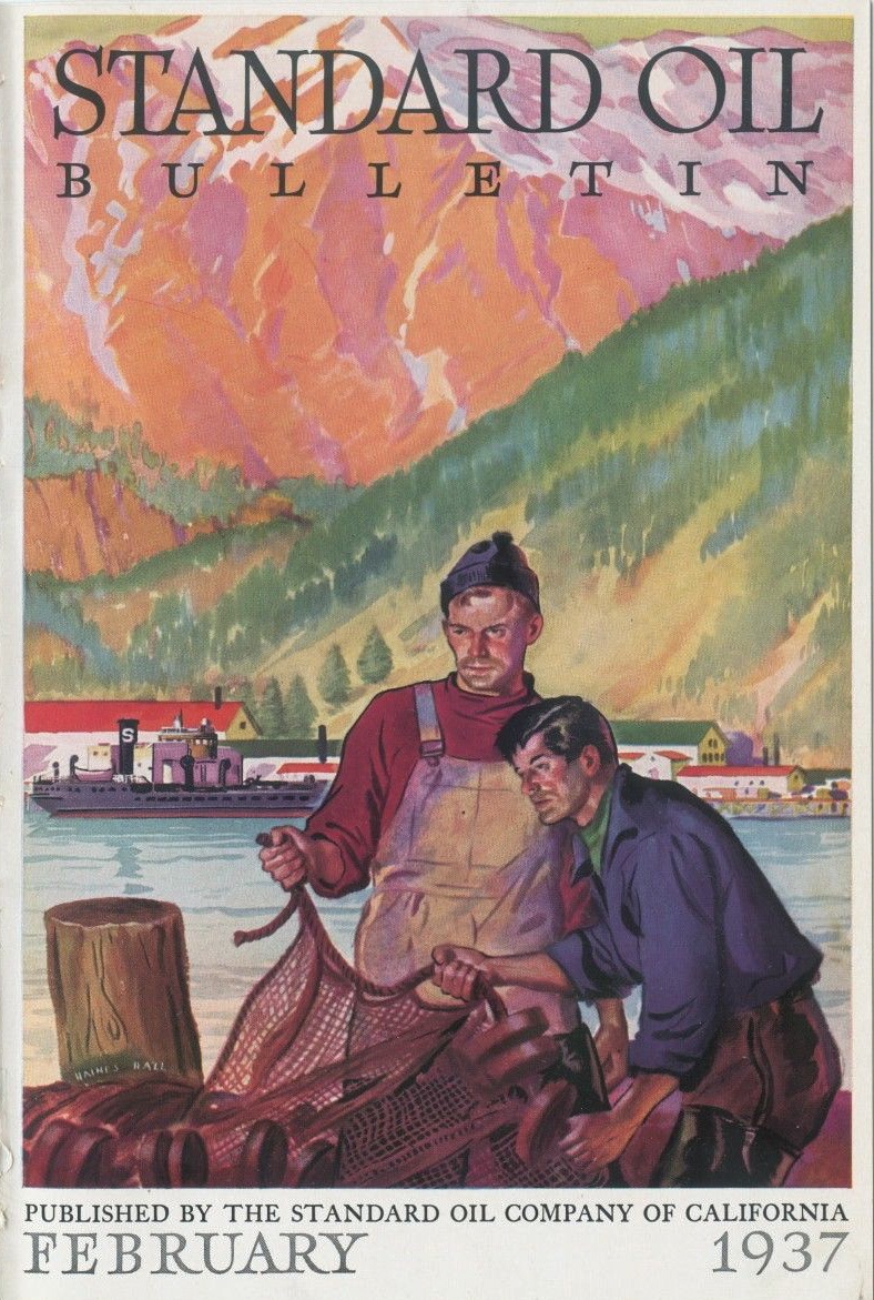
His color palette for the Bulletins tended toward the pastels, none more striking than this 1937 issue, depicting two fisherman:
Haines Hall was a talented artist and left us some beautiful imagery capturing the spirit of the American West in the 1930s, '40s and '50s.
Images for Haines Hall's Standard Oil covers provided by Tenth Letter of the Alphabet.